8 Reasons Your Shopify Store Gets Traffic But No Sales (3 Case Studies)
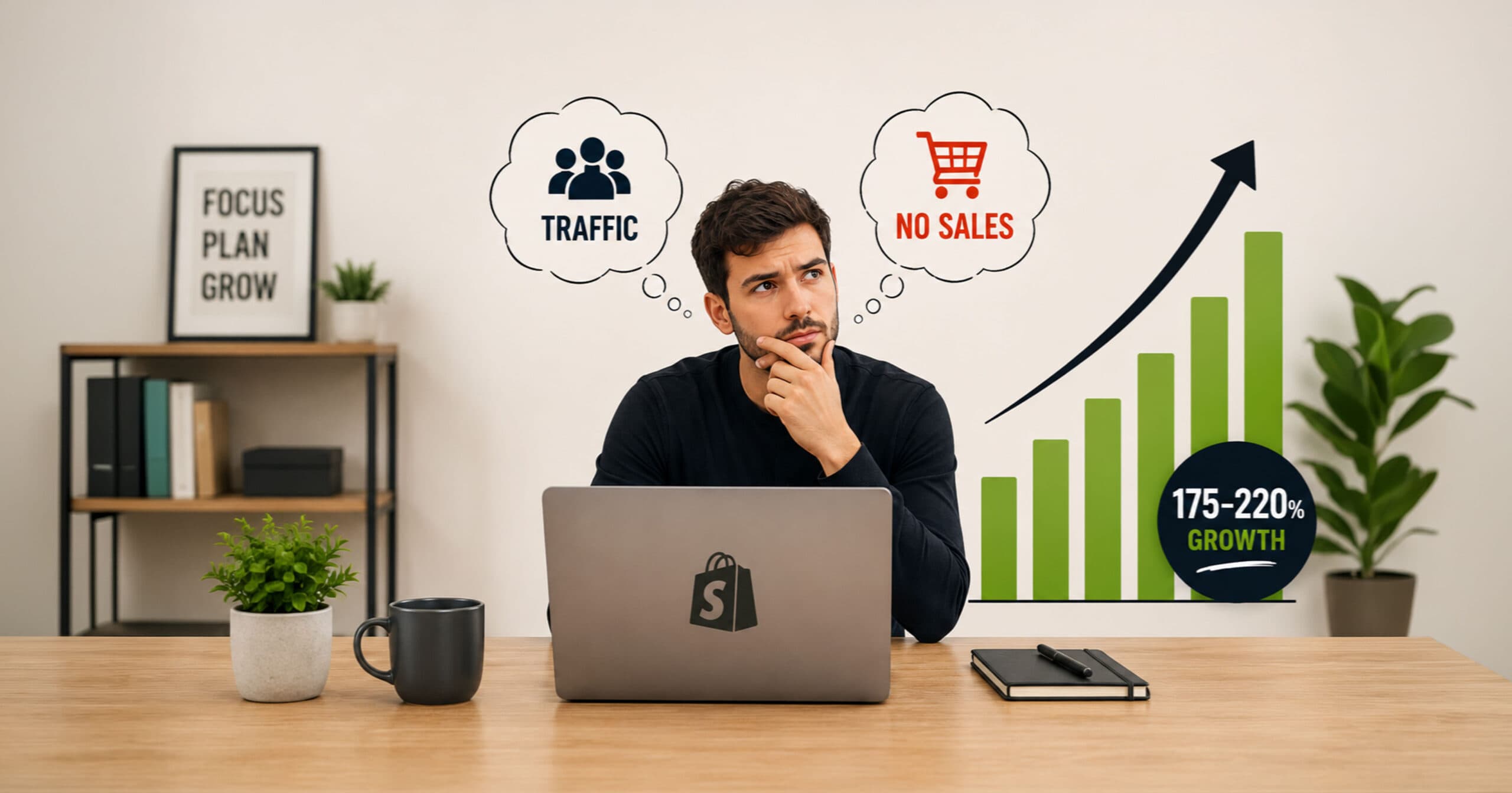
You’ve done the hard part.
You built the store, ran the ads, and created the content. People are actually visiting, and Google Analytics confirms it.
And yet, you’re getting traffic but no sales. No dings, no orders, just traffic that shows up and quietly leaves.
I’ve been a Shopify designer & CRO specialist since 2016 (Fiverr Pro Vetted, Top Rated, 5.0 rating across 600+ reviews), auditing and redesigning stores for clients worldwide. And I’ll tell you something that took me a while to fully believe.
Most stores getting traffic but no sales don’t actually have a traffic problem.They have a trust problem.
Your visitors land on your store. They look around for about 8 seconds. And the design, messaging, branding, and social proof either convince them to stay and buy, or they leave.
Most stores fail that 8-second test, not because the product is bad, but because the store isn’t doing its job.
In this article, I’ll walk you through how to tell which problem you actually have, and then the real reasons stores fail to convert, drawn from my own experience redesigning stores that went from nearly zero sales to 4–6%+ conversion rates. I’ll show you exactly what changed and why it worked.
Getting Traffic But No Sales? Rule This Out First
Before you touch a single design element, check this: it changes everything else you do.
Not all traffic is created equal.
A visitor who searched “best insulated water bottle for hiking” and clicked your Google result is close to a buying decision.
A visitor who was scrolling Instagram and tapped an ad mid-scroll wasn’t looking to buy anything; they were interrupted. Both show up as “traffic” in your analytics. They don’t convert close to the same rate, and no amount of store redesign turns an uninterested scroller into an intentional buyer.
How to tell which one you’re dealing with:
- Check conversion rate by traffic source in Shopify Analytics, not just your overall number. If organic search or email converts reasonably but paid social is near zero, your store probably isn’t the core issue; your targeting or ad creative is.
- Look at bounce time by source next. If it’s high across every source, that usually points to something on the page itself (speed, clarity, design). If it’s high on one source only, especially cold paid social, that’s more likely a traffic-quality or ad-mismatch signal instead.
- Finally, check whether ad traffic is landing on your homepage instead of the specific product the ad promised. A mismatched landing page tanks conversion no matter how good the store is.
Intent-driven traffic (search, referral, direct, email) tends to outconvert interruption-driven traffic (cold paid social) because of the difference in buying intent, though the size of that gap varies by product, price point, and campaign quality.
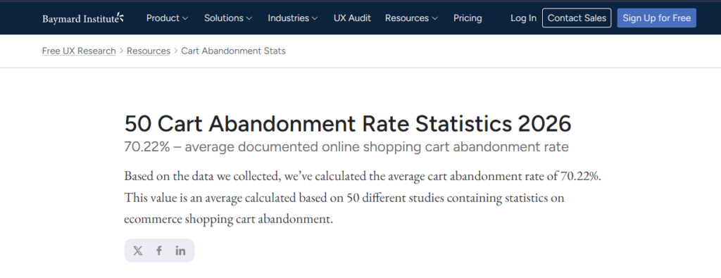
It’s also worth remembering that even well-optimized stores lose most cart-adding visitors before checkout; Baymard Institute’s ongoing research puts the average cart abandonment rate at just over 70%, so some drop-off is normal and not always a sign something’s broken.
Still, if your source-level numbers check out and people are landing on the right page, the problem is your store, and everything below applies. If they don’t check out, fix targeting and landing pages first.
01. Your Store Isn’t Built for Mobile (And Most of Your Traffic Is on Mobile)
This is the single most common problem I see, and it’s also the most fixable.
When you’re designing your Shopify store, you’re sitting at a laptop. You’re checking how the hero looks on a 1440px screen. Everything looks great. You hit publish.
But the majority of your traffic? It’s on a phone.
And on a phone, your hero image is cropped wrong, font sizes shrink to unreadable, the “Add to Cart” button sits half off-screen, and product descriptions turn into a wall of unbroken text nobody will read.
Mobile optimization isn’t just making the layout responsive; it’s designing for the mobile experience first. That means large, tappable buttons. Product images that load fast and look sharp on retina screens. A sticky Add to Cart button that follows the user as they scroll. Navigation that actually works with a thumb.
Real talk: I redesigned a store where over 70% of traffic was mobile, but the mobile experience was so broken that virtually no conversions came from phone users. After a mobile-first rebuild, that changed completely within weeks.
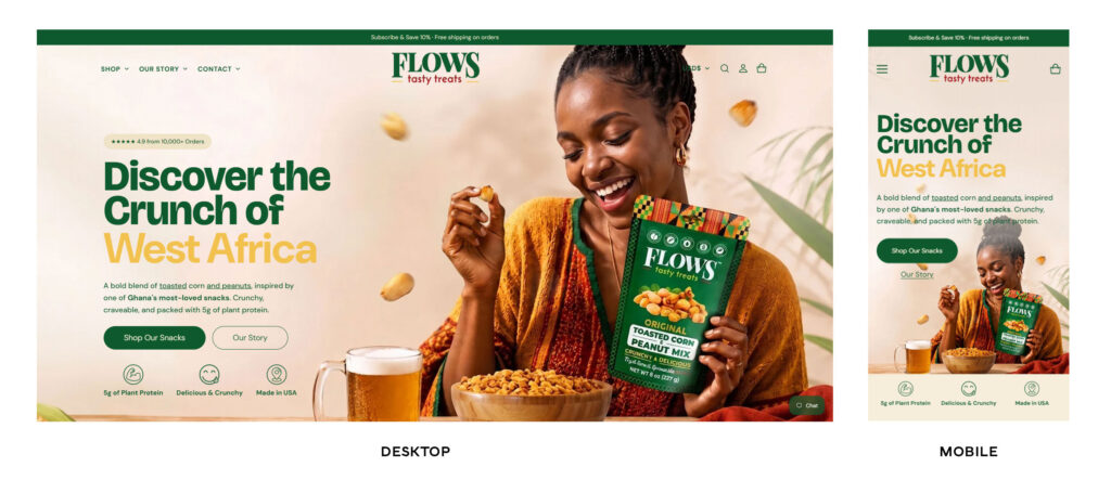
Quick Mobile Audit: Check These Right Now
- Open your store on your actual phone (not Chrome’s mobile emulator)
- Can you see the “Add to Cart” button without scrolling past the fold?
- Is your hero image cropped in a way that still makes sense on mobile?
- Can you read your font size without zooming in?
- Does the checkout flow work smoothly on a small screen?
02. You’re Not Building Trust Fast Enough
Here’s something counterintuitive that I’ve learned from dozens of store audits: too many trust badges can actually reduce trust.
When a store plasters 12 different security badges across the footer, a padlock icon next to every button, and three different “100% Money Back Guarantee” banners, it starts to feel desperate. Real brands don’t do that; instead, brands with legitimacy let their reviews, their photography, their consistent design, and their transparent return policy speak for them.
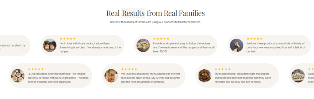
Trust isn’t built with badges. It’s built with evidence. And the most powerful trust evidence you have is customer reviews: real ones, with names, photos where possible, and specific details about what the product did for them.
What Actually Builds Trust
In the stores I’ve redesigned that saw the biggest conversion jumps, the trust improvements came from:
- Positioning reviews prominently on the homepage (not hidden in a tiny footer widget)
- Featuring user-generated content like customer photos
- Showing a face: the founder’s story, a behind-the-scenes clip, a “who we are” section that feels human
- A clean, professional design that signals legitimacy before a word is read
When people can see a real person behind a brand, they buy. Design quality signals product quality. It’s unfair, but it’s true.
03. Your Product Photos Aren’t Doing Their Job
One of the fastest ways to kill sales on a Shopify store is with photos that look artificial, amateurish, or obviously AI-generated in an unconvincing way.
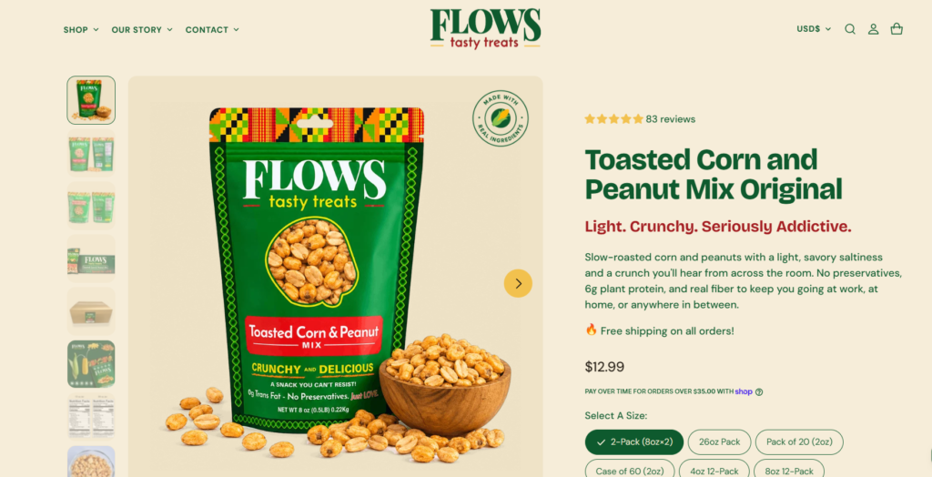
Shoppers cannot touch or try your product. Your photos are doing the work of a physical store experience. They need to show the product in use, in context, at multiple angles, in lifestyle settings that help the customer visualize owning it.
I’ve worked with clients who were using flat, overexposed product shots on white backgrounds for every single image: no lifestyle, no context, no scale. People couldn’t connect with the product emotionally. Once we introduced real lifestyle photography (and in some cases, realistic AI-assisted lifestyle imagery that actually looked authentic), engagement on product pages increased immediately.
Note: AI product photos can work, but only when they look genuinely realistic. A customer can tell the difference between a careful AI composite and a lazy render. The uncanny valley applies to product photography too.
What Every Product Page Needs (At Minimum)
- A clean hero shot
- At least one lifestyle image showing the product in real use
- A detail or texture shot
- A size or scale reference where relevant
- Clothing: multiple body types if possible
- Home goods: room settings
- Food products: styled preparation or serving shots
04. You’re Selling Specs When You Should Be Selling Outcomes
Read your current product descriptions. Are they a list of features? Weight, dimensions, materials, quantity per pack?
That’s the wrong approach, not because those details don’t matter, but because nobody buys a product for its specs. They buy a product for what it does to their life: the feeling it gives them, the problem it solves, the identity it lets them express.
Spec-Driven vs. Outcome-Driven: The Difference
| ❌ Spec-driven (doesn’t sell): | ✅ Outcome-driven (sells): |
| 500ml stainless steel bottle | Your coffee stays hot for 12 hours |
| Double-wall insulated | No sweaty condensation on your desk |
| BPA-free lid with carrying loop | Fits every cup holder, bag, and backpack |
| Available in 4 colors | The bottle people ask about at the gym |
Notice the difference?
The second version sells the feeling, the convenience, the social proof embedded in the copy, the identity. Those are the things that move people to click “Add to Cart.”
I think about this in terms of what the customer is really buying: not a product, but an emotion, a convenience, a status signal, a memory they’ll have, a version of themselves they want to become. When your product descriptions speak to those things (in your target customer’s language, their specific pain points, their aspirations), conversion rates go up.
Result from a real store: after rewriting product copy to focus on outcomes instead of ingredients for a natural living brand, sales grew by 175%.
05. You Look Like Every Other Shopify Store
There’s a look that every experienced e-commerce shopper subconsciously recognizes: the standard Shopify dropshipping aesthetic. A white background. The default product grid. A generic hero with a bold headline in an overused font. Cookie-cutter trust badges in the footer.
When a visitor hits that store, they’ve seen it a thousand times, so their guard goes up immediately. It reads as a generic reseller, not a brand they want to be part of.
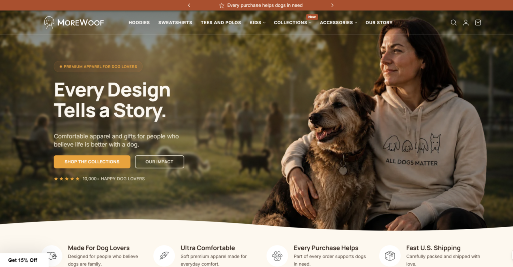
Real brands have a visual identity: a color palette that’s theirs, typography that matches their personality, a consistent aesthetic across every page: the product photography, the icons, the spacing, the way text is styled. When these things work together, visitors feel like they’ve stumbled on something specific. Something real.
Branding isn’t expensive to do well.
It’s a decision about who you are and consistency in executing that decision. A homestead brand should feel warm, earthy, slightly nostalgic; every design choice should reinforce that. A minimalist skincare brand should feel clean, precise, clinical-but-luxurious. When the design tells a coherent story, customers buy into that story.
06. You’re Not Showing Up Organically (And You’re Hiding the Face Behind the Brand)
A lot of store owners spend money on paid ads but ignore organic social content entirely. This is a mistake for two reasons: organic content builds trust in a way that ads cannot, and consistent organic presence keeps your brand alive in the minds of people who’ve already visited your store but didn’t buy yet.
Even more importantly: showing your face builds trust faster than anything else you can do.
When a founder shows up in their content talking about why they started the brand, showing how the product is made, sharing their real opinion about something in their niche, the brand suddenly becomes human. And people buy from people.
Don’t Underestimate User-Generated Content.
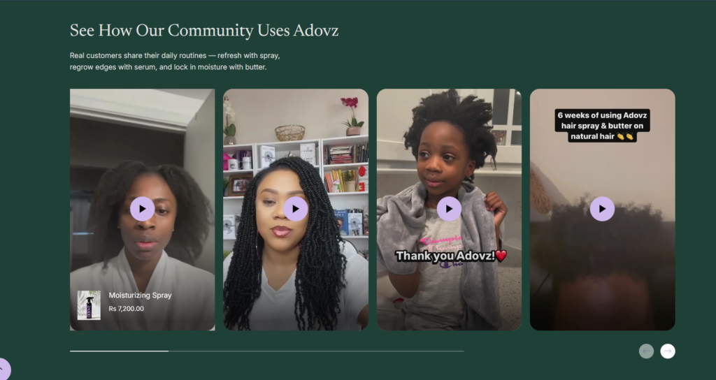
UGC is one of the most underused assets a Shopify store owner has. If you have customers who love your product, encourage them to post about it. Repost their content. Feature their photos on your product pages. Real customers using real products is the most credible advertising you can have, and it costs almost nothing to collect if you:
- Add a follow-up email after purchase asking for a photo and review
- Include a card in the packaging with a simple request
- Offer a small discount in exchange for a tagged post
07. Your Email Marketing Is All Product, No Value
If your email list only hears from you when you have a sale or a new product launch, you’ve trained them to ignore you between promotions, or unsubscribe entirely.
Email marketing works when it builds a relationship. That means sending content that genuinely helps your customer, even when you’re not asking them to buy anything.
- Natural living brand: a recipe, a cleaning tip, a guide to reading ingredient labels
- Plant subscription brand: care tips for a specific succulent species
- Meal prep brand: macro education or quick prep ideas
When you provide value consistently, your subscribers start to trust you and look forward to your emails. Then, when you do send a product email, they’re actually receptive because you’re not just someone who shows up to ask for money; you’re someone who’s been helpful for months.
Simple rule to follow: three value emails for every one promotional email. Give more than you ask for.
08. You’re Ignoring Long-Term SEO
Paid traffic stops the moment you stop paying.
SEO traffic compounds over time. Yet most Shopify store owners either ignore SEO entirely or treat it as a one-time task from when they first set up their store.
What Long-Term SEO for a Shopify Store Actually Means
- Product pages have unique, keyword-relevant descriptions, not the manufacturer’s copy, duplicated across dozens of sites
- Collections have descriptive introductory text
- A blog that answers real questions your customers are searching for: the kind that pulls in buyers at exactly the moment they’re researching a purchase
- Technical basics: fast load times, image alt text, clean URLs, and Shopify’s built-in SEO fields filled out for every product
SEO isn’t glamorous. It takes time before you see results.
But the stores that invest in it consistently are the ones that still have healthy, free traffic two years from now, when everyone else is still dependent on rising ad costs.
Real Stores, Real Results: Three Case Studies
I want to show you this in concrete terms. Here are three stores I worked with where traffic wasn’t the problem: everything else was.
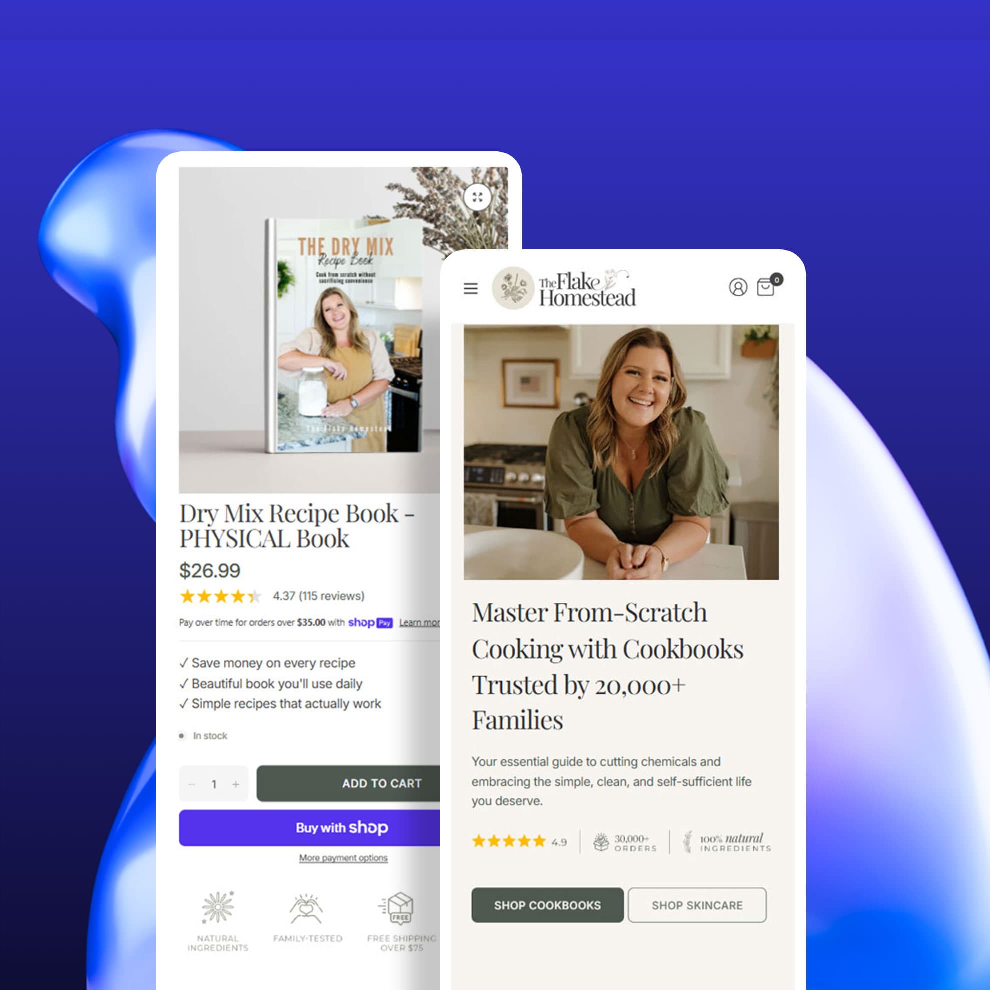
Case Study 01: “The Flake Homestead” (Natural Skincare & Homestead Cookbooks)
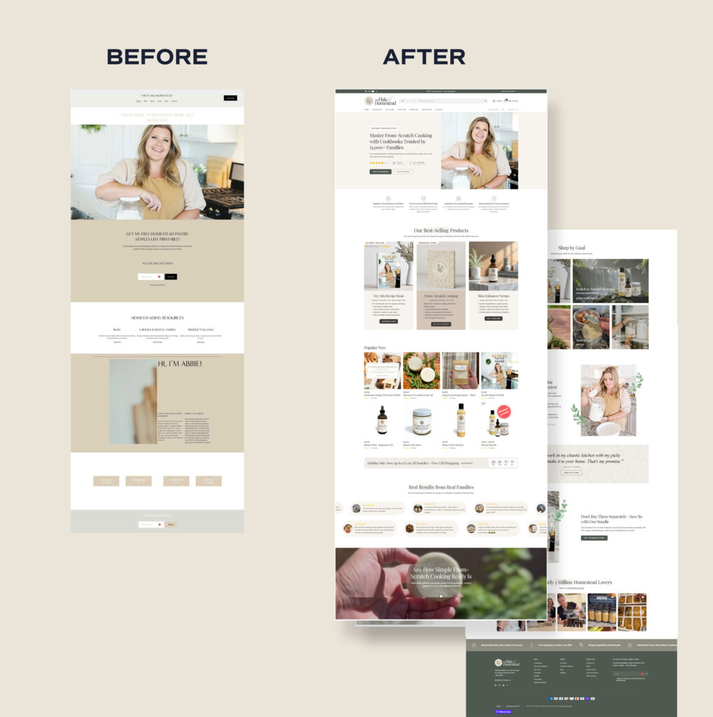
A growing homestead lifestyle brand with a large and loyal social media following, the kind of audience that should have been converting easily. The product was excellent: natural skincare and from-scratch cooking guides trusted by over 20,000 families.
The traffic was there. Sales weren’t.
Problems: Generic hero section with no emotional hook. Weak social proof placement. Poor mobile experience. Mismatched color palette with no brand cohesion. Product pages listing specs, not benefits. No clear buyer journey through the homepage.
What we fixed: Complete homepage redesign with a strategic layout. The avg. ratings placed above the fold. Rebuilt mobile experience end-to-end. New warm, earthy color palette on brand. Product pages rewritten around benefits and emotion. Better product photography using realistic AI imagery.
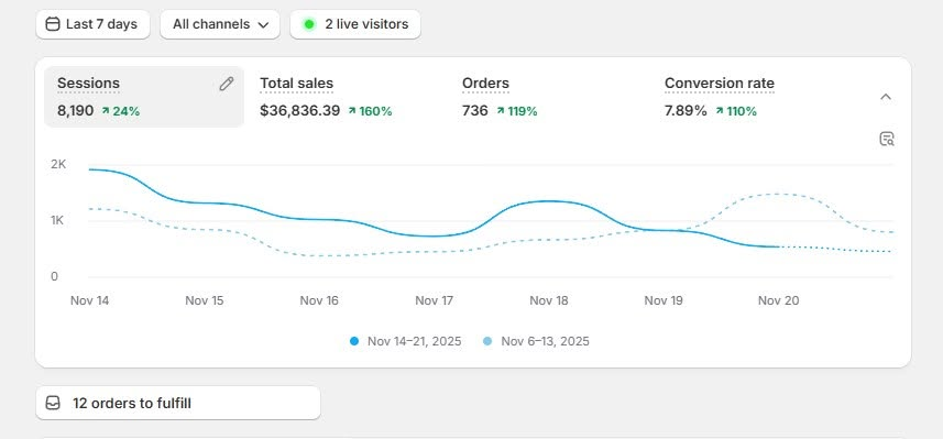
Results: 160%+ sales growth · 6-8%+ conversion rate
Case Study 02: “Succly” (Monthly Succulent Subscription Boxes)
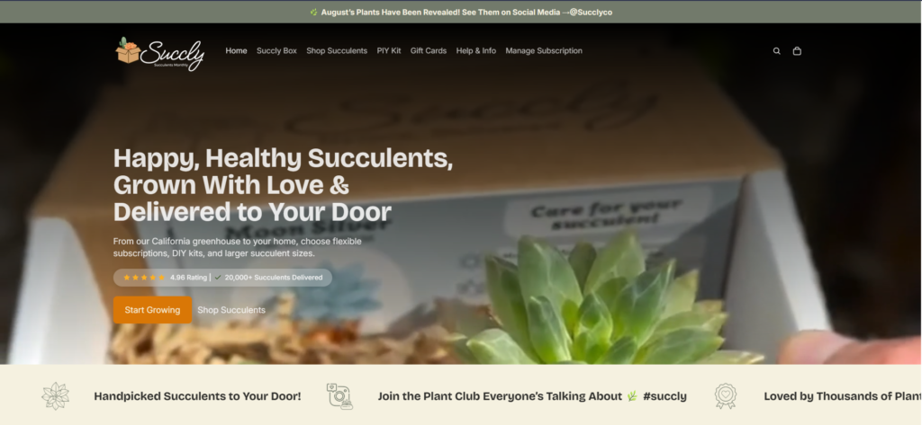
A subscription-based plant brand with a genuinely fun product. The concept was clear in theory, but on the website, visitors couldn’t figure out what they were actually getting, how the subscription worked, or why one plan was better than another. The result: browsers, not buyers.
Problems: Subscription value never clearly stated. Disorganized homepage with no clear narrative. Hero section explained nothing about the product. Confusing mobile navigation. No trust signals or social proof. Unclear subscription plan differences.
What we fixed: Clear subscription value messaging at the top of the page. Complete homepage restructure with a logical story flow. Hero rebuilt to answer “what is this?” within seconds. Streamlined subscription purchase flow. Trust signals and review section added. Plan comparison layout that made the choice obvious.
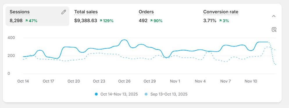
Results: 3.2× subscription growth · Close to 4% conversion rate
Case Study 03: “Mother of Macros Café” (Macro-Balanced Meal Prep)
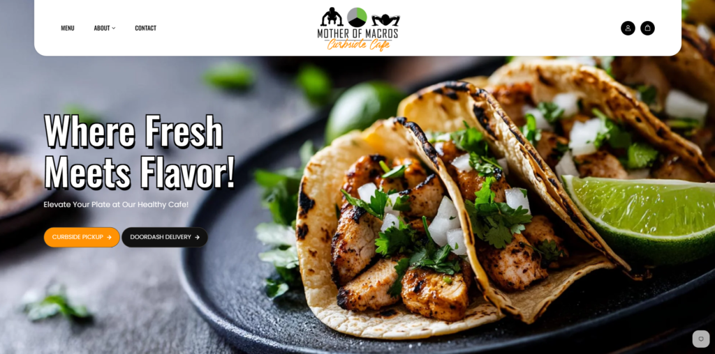
A popular healthy meal prep company with a real customer base and excellent product.
The problem: the website made ordering feel like solving a puzzle. Customers couldn’t figure out which meal plan was right for them, how delivery worked, or where their zip code fit in. Confusion is the enemy of conversion.
Problems: Confusing, overwhelming meal plan choices. No clear way to check delivery availability by zip code. Hero section unclear about what the brand does. Meal prep timing and delivery info buried deep in the page. Friction throughout the ordering process.
What we fixed: Visual meal comparison layout so customers could choose in seconds. Zip code ordering flow built into the homepage. Hero rebuilt for immediate clarity. Delivery schedule displayed clearly per meal plan. Simplified ordering navigation throughout.
Results: 190% increase in orders · 5.6% conversion rate
Notice the pattern across all three: the products were good, the traffic was real, and the problem was always the same: the store wasn’t doing its job of converting visitors into buyers. Design, clarity, trust, and messaging were the levers that changed everything.
Before You Spend Another Dollar on Ads, Do This
Here’s the most common mistake I see store owners make after their traffic isn’t converting: they run more ads. They spend more money bringing more people to the same broken experience. And the results don’t improve, because the problem was never the traffic.
Before you increase your ad budget, audit your store honestly:
- Open your store on your phone and go through the purchase flow. Is it smooth?
- Read your product descriptions. Do they sell outcomes, or specs?
- Look at your homepage. Does it tell a brand story, or could it belong to any store?
- Where are your customer reviews? Are they front and center, or buried at the bottom?
- Do you have UGC (real customer photos)?
- Is the face of your brand visible anywhere? Do customers know who made this?
- Is your email list hearing from you when you’re not selling something?
- Are you creating any content that helps your customer beyond product promotions?
- Have you checked your conversion rate by traffic source, to rule out a targeting problem before you rebuild anything?
The good news is that every one of the problems in this article is fixable.
None of them require a complete rebuild from scratch.
They require honest assessment and deliberate changes, the kind that I’ve seen turn flat stores into genuinely thriving businesses.
Your traffic is an opportunity. The visitors coming to your store are people who’ve already shown interest. They searched for what you sell, clicked on your content, and they’re there. Make sure the store they land on gives them every reason to stay and buy.
Frequently Asked Questions
Almost always one of two things: your store isn’t convincing visitors to trust and buy (design, messaging, social proof, mobile experience), or your traffic isn’t buyer-intent traffic in the first place (wrong audience, cold interruption-based ads sent to the wrong page). Check conversion rate by source before assuming it’s your store.
Most of the fixes in this article; hero clarity, mobile experience, product page restructuring, review placement can be implemented within a week or two. You’ll typically start seeing the impact in your conversion rate within the following few weeks of traffic, once enough visitors have gone through the updated experience.
It’s common, but it’s rarely the ceiling. The stores in the case studies above moved from roughly that range into the 4–6% range after addressing trust, clarity, and mobile experience, without changing the product or the traffic source.
Most Shopify stores don’t have a traffic problem. They have a trust problem. Visitors are landing on the store, but the design, messaging, branding, and social proof fail to convince them to buy. Fix the store before you fix the ads.

Written by
Ruchira Madushan
Founder · Shopify Designer & CRO Specialist
Ruchira Madushan, known as “Ruchi,” is the founder of Dreamy Codes and a Shopify designer and CRO specialist with a decade of hands-on experience. He helps brands create Shopify stores that look better, work better, and convert better.
Ready to take your Shopify store to the next level?
Let’s Work Together